
Why Minimalism Is No Longer the Ultimate Web Design Solution
Minimalism in web design was long considered a near-failsafe choice. White space, neat typography, a single accent color—this approach seemed equally suited to startups, brands, media, and services. Minimalism was perceived as synonymous with “modernity” and “professionalism.” But in recent years, it has become noticeable: websites built using the same minimalist templates are increasingly losing their character, failing to hold attention, and failing to explain why the user is there in the first place.
The problem isn’t minimalism itself, but how it’s been used—mechanically and without context. Minimalism has ceased to be a tool and has become a default, applied “just in case.” And this is precisely where it stops working.
Where Minimalism Makes Sense
Minimalism is effective when the user arrives with a clear intent and doesn’t require additional navigation or explanations. For example, in interfaces with regular use—banking apps, work dashboards, internal services. Here, excessive visual elements only impede. It also thrives in niches where visual silence enhances trust, such as designer portfolios, architectural studios, and contemporary art galleries.
In such cases, minimalism enhances the object rather than competes with it. The content already speaks for itself, and the design’s job is not to interrupt. But the key condition is the presence of strong content or a clear use case. If the user understands where they’re going and why, minimalism becomes a convenient backdrop. If not, it becomes a void.
Where minimalism becomes harmful
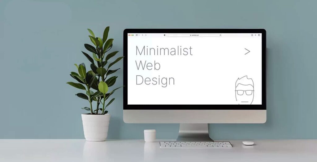
Problems arise when a website is supposed to explain, persuade, or evoke emotion. When the first screen is occupied by a logo, an abstract slogan, and a button without context, the user is forced to guess the meaning. As a result, the site looks “clean” but doesn’t work.
This is especially noticeable in niches with intense competition for attention, such as marketplaces, media, and entertainment services. A striking example is offered at casino en ligne le plus payant in France, where users come not for the interface itself, but for the experience, atmosphere, and sense of involvement. Overly sterile minimalism in such projects undermines dynamism and renders the platform indistinguishable from dozens of others.
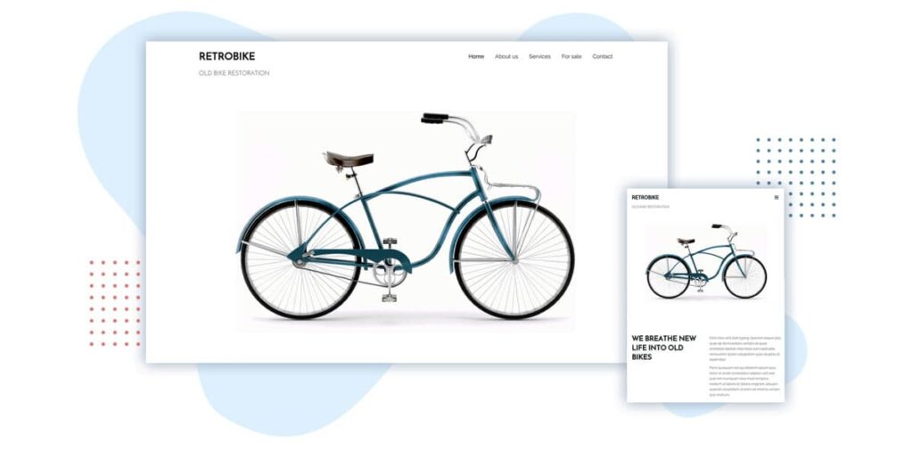
Minimalism also performs poorly as a branding tool if a company lacks a strong visual code. When all websites use the same fonts, grids, and animations, the brand becomes indistinguishable. The user doesn’t remember where they’ve been because they’ve “seen it before.” It’s especially dangerous when minimalism is used as a replacement for strategy: instead of thinking through the structure, meaning, and user journey, everything is simplified to the extreme—and hoped that “purity” will save the day.
What’s Replacing Universal Minimalism Today
Modern web design is increasingly moving away from the principle of “less is more” toward the principle of appropriateness. The question now is which specific elements are needed in a particular context. In one project, this might be a dense visual language with textures, in another, rich typography, in a third, intentional asymmetry or complex transitions.
It’s important to understand that users no longer perceive a website as a “design object.” They evaluate it as an environment: is it understandable, is it lively, does it convey character? Here, excessive minimalism often yields to bolder, more meaningful solutions. Here’s where minimalism most often fails:
- Websites with emotional or entertaining content that require atmospher
- Projects without a strong brand, relying solely on a “clean” UI
- Services that need to quickly explain their value and differentiation
- Platforms with a broad audience, rather than a narrow professional segment
This list doesn’t mean minimalism is prohibited there. It means that in these cases, it’s insufficient.
Minimalism as a Conscious Choice
Minimalism remains a powerful tool—but only when used consciously. When the designer understands what they’re removing and why, rather than simply following a trend. Sometimes the best solution is to add visual noise to give the site a sense of life. Sometimes, it’s to complicate the structure so the user doesn’t feel lost in empty space.
Good modern design begins not with the question “should I go minimalist?” but with the question “what should be felt here?” And if the answer is energy, character, tension, or playfulness, then excessive sterility will work against the goal. Minimalism is no longer a universal answer. It’s just one option—and not always the best one.